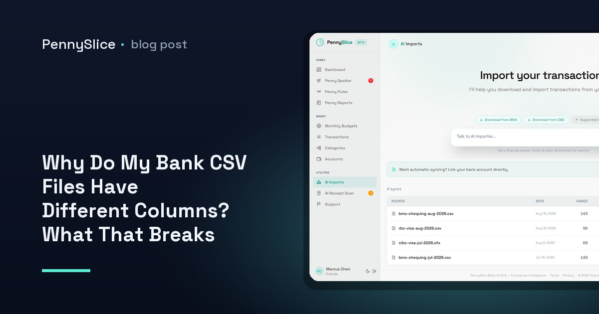
Category: PennySlice

  • Why Do My Bank CSV Files Have Different Columns? What That Breaks and How to Merge Them Anyway

    Why Do My Bank CSV Files Have Different Columns? What That Breaks and How to Merge Them Anyway

    You export two months of transactions from your checking account, and it works. Column A is the date, column B is the description, column C is a negative number when money leaves. You build a pivot table, you feel briefly competent.

    Then you export the joint account from the second bank. Column A is a date, but written 03/07/2025 instead of 2025-07-03. There is no amount column — there is a Debit column and a Credit column, both positive, one of them always blank. There are four rows of account-holder details above the header. Your formula returns #VALUE! on every line, and the pivot table now thinks you spent nothing all quarter.

    Nothing is broken. The two files are just describing the same thing in two different shapes.

    Why do my bank CSV files have different columns?

    There is no standard for a bank statement CSV. There are standards for other things — OFX is a defined format, and so is the fixed-layout data banks exchange between each other — but the CSV download is a convenience export, generated by whatever core banking platform the bank runs, styled by whatever team owned the online banking rewrite that year.

    That leaves each bank free to make a handful of independent decisions, and the combinations multiply fast.

    How the amount is expressed. Two schools. Signed amount: one column, -42.60 for a purchase, 1,800.00 for a deposit. Or split columns: Debit and Credit, both positive numbers, with the sign implied by which column is populated. A third variation writes outflows in parentheses — (42.60) — which spreadsheets read as text unless coaxed.

    How the date is written. 03/07/2025 is the 3rd of July in most of the world and the 7th of March in the United States, and the file rarely says which. Some exports go further and split the date into separate Day, Month and Year columns, or give you two dates — transaction date and posted date — with no indication of which one your spreadsheet should sort on.

    How the description is packed. One bank gives you a clean merchant name. Another concatenates merchant, city, card last-four, terminal ID and reference number into a single 90-character string. A third splits the same information across Description, Memo and Reference, and puts the useful part in whichever one it feels like that day.

    What else rides along. Running balance columns, currency columns, transaction type codes, cheque numbers, category labels the bank guessed at. Useful sometimes. Not present consistently.

    What surrounds the data. Preamble rows with the account number and statement period. A blank row between the header and the first transaction. A totals row at the bottom that looks like a transaction and is not. Semicolons instead of commas as the delimiter, which is normal across much of Europe because the comma is already the decimal separator. Encoding that mangles accented merchant names.

    Every one of those is a defensible local decision. Together they mean two files from two banks, describing identical activity, share almost no structure.

    Why one formula never survives two accounts

    The spreadsheet approach fails in a specific way, and it is worth naming because it explains the wasted afternoons.

    A formula encodes assumptions about position. =SUM(C2:C500) assumes the amount is in C and starts on row 2. The moment the second file has its amount in D and E and starts on row 6, you are not adjusting a formula — you are rewriting a small program, and you will rewrite it again next month when the bank adds a column.

    So people normalise by hand. Delete the preamble rows. Insert a column. Write =IF(D2>0, -D2, E2) to collapse debit and credit into one signed number. Reformat the dates, discover half of them silently transposed day and month, fix those. Strip the totals row. Then repeat, from memory, in four weeks.

    The cost is not the effort. It is that a manual step done monthly gets skipped, and a merged view that is two months stale answers nothing. This is the point at which most people quietly stop tracking, which is the same reason expense trackers get abandoned at the setup step rather than at the using step.

    It gets worse with more accounts. A household running five to eight accounts across two banks and two cards is merging five to eight incompatible layouts, before anyone has agreed who is doing it.

    Merging CSV files with different formats without mapping columns

    The alternative to normalising by hand is to have the file read as it is.

    PennySlice detects structure on import. Drop the file in and the AI reads it — finds where the real header row is, works out which column holds the amount, recognises a debit/credit pair and collapses it, infers the date format from the spread of values across the whole file rather than guessing from the first row, and identifies the description field even when it is three fields glued together.

    There is no template to pick and no column-mapping screen. You do not tell it that column D is the debit column. That matters more than it sounds, because column-mapping is exactly the step where setup stalls: it asks you to understand your bank’s export conventions before you are allowed to see a single number.

    Mix layouts freely. Two banks with opposite amount conventions land in the same dataset, correctly signed. The formats accepted are CSV, Excel, OFX, PDF, email forwarding and a photo of a receipt — so an account that only offers a PDF statement is not excluded from the merged view.

    Once the transactions are in one place, they are categorized automatically, including at the line-item level within a single purchase — a Costco trip split across groceries, clothing and household rather than dumped into one bucket.

    What you get on the other side of the merge

    A merged dataset is the precondition for every question worth asking. Spending by category across all accounts, not per account. A recurring charge spotted on the card and the checking account as one subscription rather than two coincidences. A question typed in plain English — “what did we spend on groceries in Q2” — answered with a figure drawn from every file you imported, not the one that happened to open cleanly.

    Penny Spotter runs seven background detectors across that combined data: budget pace, category anomalies, recurring cost creep, predicted expenses, savings opportunities, income changes and merchant concentration. None of them work well on one account in isolation, because spending is not organised by account.

    Import requires no standing connection to anything — the file is the whole handshake. If you would rather have transactions arrive on their own, bank linking is available on paid tiers in the US and Canada through Plaid, where your login is entered at your bank and what comes back is a revocable read-only token. You can mix both.

    Export last month from your two most awkward accounts and drop both files in as they are. If they land as one clean list, you never have to write the reconciliation formula again.

    PennySlice provides spending information, not financial advice.
  • Separate Accounts, One Household View: How to Track Spending Without a Joint Bank Account

    Separate Accounts, One Household View: How to Track Spending Without a Joint Bank Account

    Rent leaves one account on the 1st. Childcare leaves the other on the 3rd. Groceries alternate depending on who is closer to the store that week, and the Costco run in the middle of the month goes on whichever card is in the front of whichever wallet. Nobody is hiding anything. But when one of you asks what the household actually spent on food last month, the honest answer is a shrug and a promise to look into it.

    That is not a money problem. It is a reporting problem. The money never pools, so no single statement ever shows the household. Each of you can see half.

    The reporting problem is combining, not merging

    Most tools quietly assume one person with one set of accounts. That assumption breaks the moment two people share expenses out of separate accounts, and it breaks in a specific way: totals are always wrong by exactly the amount the other person paid.

    So the household finance admin — and there is always one — starts doing it by hand. Export one account, export the other, paste both into a spreadsheet, deduplicate the transfer where one of you reimbursed the other, guess at categories, and arrive at a number two weeks after it would have been useful.

    What you need is not a joint account. It is a single categorised view built from two sets of accounts that stay exactly where they are.

    How to track spending without a joint bank account

    Three things have to be true for the combined view to be worth having.

    Both people’s data has to get in, by whatever route suits each person. In PennySlice you choose how data flows in, per account. Link a bank through Plaid — the login is entered at your own bank, and what comes back is a revocable read-only token for transactions and balances. Or import your own file: CSV, Excel, OFX, PDF, forwarded email, or a photo of a receipt. Bank linking is available on paid tiers, in the US and Canada. Import works regardless of where you bank.

    That per-account choice matters more for couples than for anyone else, because the two of you often do not want the same thing. One person links their checking account and stops thinking about it. The other prefers to upload statements rather than connect anything, or banks somewhere linking is not offered. Mixing both in one household is normal, not a workaround, and a link can be revoked at any time from either side.

    Categories have to be consistent across both people. If your grocery spend is labelled “Groceries” and your partner’s is spread across three merchant names that never got categorised, the combined total is fiction. Categorisation happens automatically on import, and corrections one person makes carry forward — which is the part that decides whether a household view stays trustworthy in month four. The mechanics of automatic categorisation, and where it mislabels, are worth understanding before you judge the first month’s numbers.

    Shared expenses have to be visible as household expenses. Household sharing puts multiple people, shared accounts and shared budgets into one view. Rent paid from one account and childcare paid from the other land in the same place, against the same budget, without either of you moving a dollar.

    Household spending with separate accounts, at the line-item level

    Here is where separate accounts get genuinely messy, and where the usual fix fails.

    The mid-month Costco trip is $214. Whoever paid it, that transaction lands in one account with one merchant name and, in most tools, one category. Call it Groceries and your food number is inflated by the amount that was actually a jacket, dish soap and a case of printer paper.

    PennySlice splits a single purchase across several categories at the line-item level. One Costco trip becomes groceries plus clothing plus household, automatically. Photograph the receipt and the OCR itemises the lines and categorises them individually. If you want the long version, there is a walkthrough of splitting one Costco receipt across categories.

    For a household running separate accounts, that split is the difference between a shared grocery budget you believe and one you argue about. It is also the difference between “we spend too much at Costco” and knowing which category the money actually went to.

    Ask the question instead of building the spreadsheet

    Once both people’s data is in, the interface is a conversation. You ask in plain English and the answer comes back grounded in your own transactions, with real figures.

    • “What did the household spend on groceries last month, across both accounts?”
    • “How much went to childcare this quarter?”
    • “Which category is furthest over budget right now?”
    • “Can we afford a $1,400 washing machine next month?”

    That last one goes through Pulse Check, which answers what-if questions against real balances and history and returns a number rather than a maxim. Chat covers eight areas: transactions, accounts, categories, budgets, imports, receipts, predictions and what-if scenarios. If you want the full map of what is answerable, there is a breakdown of the eight areas an AI can analyse from your statements.

    The practical effect on a two-account household is that the person who used to maintain the spreadsheet stops maintaining it, and both people can ask the same question and get the same answer.

    What runs without either of you asking

    Separate accounts hide drift. A subscription that rose by $3 on one person’s card is invisible to the other, and neither of you is auditing the other’s statement.

    Penny Spotter runs seven detectors in the background across the household’s data:

    1. Budget pace — a category on track to exceed its budget, before it does
    2. Category anomalies — spending that breaks your own established pattern
    3. Recurring cost creep — subscriptions and bills that quietly rose
    4. Predicted expenses — bills that are coming, before they land
    5. Savings opportunities — money being left on the table
    6. Income changes — earnings shifting up or down
    7. Merchant concentration — one merchant taking an outsized share

    Recurring cost creep is the one that earns its keep in a split-account household, because duplicate subscriptions are almost guaranteed when two people sign up for things independently. Finding them starts with the same combined view — the process for tracking down recurring payments and the ones that got more expensive works the same whether one account or four are feeding it.

    Penny Reports then writes a monthly summary of what happened and what to watch, which is the artefact most households actually read together.

    Start with last month, both accounts

    Pull one statement from each account for the same month — export a CSV, or drop the PDF in as-is; there is no template to pick and no column-mapping step. Let it categorise, then ask what the household spent on the two or three categories you argue about most.

    One month, two accounts, one number. That is the whole test.

    PennySlice provides spending information, not financial advice.
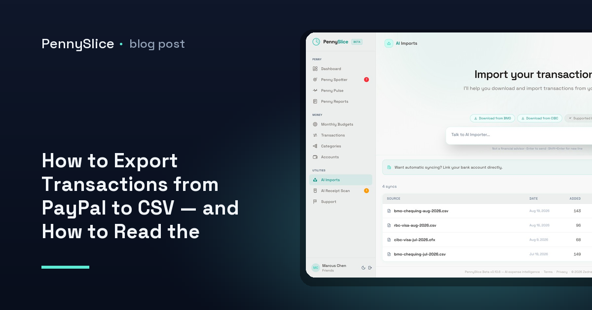
  • How to Export Transactions from PayPal to CSV — and How to Read the File Afterwards

    How to Export Transactions from PayPal to CSV — and How to Read the File Afterwards

    You scroll your bank statement looking for the subscription you meant to cancel, and you find eleven lines that all say the same thing: PAYPAL. Different amounts, different dates, no merchant. The charge you’re hunting for is in there somewhere, and the statement will not tell you which one it is.

    This is not a formatting quirk. When you pay through PayPal, PayPal is the merchant of record as far as your bank is concerned. Your bank sees a payment to PayPal. The name of the company that actually billed you — the streaming service, the newsletter, the cloud storage plan you signed up for on a laptop you no longer own — exists only inside PayPal’s activity log. To get it out, you have to go to the source.

    Why PayPal is where subscriptions go quiet

    A subscription billed directly to a card leaves a readable trail. The merchant name is on the line, so pattern detection — yours or software’s — has something to grip. A subscription billed through PayPal leaves an amount and a date and nothing else.

    That matters more than it sounds. Three of those PAYPAL lines might be one-off purchases. Four might be the same vendor at a changing price. Two might be a service that raised its monthly rate 18 months ago and has been collecting the difference since. From the bank side, they are indistinguishable. Any categorization you do on the bank export lands them all in one bucket called, effectively, “PayPal”.

    The fix is to treat PayPal as a separate account with its own statement, because functionally that is what it is.

    How to export transactions from PayPal as a CSV

    The download lives under your account activity on the web version. The mobile app does not produce the same file, so use a browser.

    1. Sign in at paypal.com and open Activity.
    2. Look for the Download option near the activity filters. On business accounts this sits under Reports.
    3. Set a date range. Go wider than feels necessary — 24 months if the option allows it. Recurring charges only become visible once you have enough repeats to see the interval, and a 90-day window will show you a monthly bill three times and an annual bill zero or one times.
    4. Choose transaction type. “All transactions” is the one you want. Filtering to completed payments only will drop refunds and reversals, and those change what a category actually cost you.
    5. Choose CSV as the file format.
    6. Request the report and wait. Long ranges are generated in the background and PayPal notifies you when the file is ready to download, sometimes several minutes later.

    PayPal moves these labels around from time to time, so if the wording differs slightly, look for the download or statements link attached to the activity view rather than the settings menu.

    A note on file type: if you are offered a PDF statement instead, take it anyway rather than skipping the export. A PDF statement carries the same merchant names, and it can be read and structured on import even though it is not a spreadsheet.

    What is actually in the PayPal transaction CSV export

    Open the file and you will find considerably more than a bank export gives you. The columns vary by account type and region, but the ones that do the work are consistent:

    • Date and time — the timestamp, not just the day, which helps when two charges land together
    • Name — the merchant. This is the column your bank statement does not have, and the reason the export is worth doing
    • Type — express checkout payment, subscription payment, recurring payment, refund, transfer
    • Gross, Fee, Net — the split matters if you receive money as well as send it
    • Currency — PayPal will happily bill you in a currency your bank then converts, so the amount on your statement rarely matches the amount here
    • Transaction ID and Reference ID — a repeating reference across several rows usually means those rows belong to the same billing agreement

    That Type column is the shortcut most people miss. Sort or filter by it and the subscription payments separate themselves from the one-off checkouts without you having to reason about amounts at all.

    How to find recurring payments in the PayPal file

    With the CSV open, three passes will surface almost everything.

    Pass one: sort by merchant name. Any name appearing four or more times in a 24-month range is a candidate. You are not looking at amounts yet, only repetition.

    Pass two: check the interval. For each repeated name, look at the gaps between dates. Roughly 30 days is monthly. Roughly 365 is annual, and the annual ones are the charges people forget entirely, because they arrive once, from a company they interacted with a year ago.

    Pass three: compare the amounts within each merchant. This is where cost creep shows up. A row that reads 8.99, 8.99, 8.99, 10.99, 10.99, 12.99 is a price that moved twice while the charge kept clearing. Nothing about that sequence is visible on the bank side, where all six rows say PAYPAL and sit next to each other in no particular order.

    Also check the reference IDs on rows where the merchant name is vague or abbreviated. Payment processors sometimes appear in the Name column instead of the actual business, and a shared reference across rows will still group them correctly even when the name does not help.

    Getting the file into something that keeps watching

    Doing those three passes by hand once is fine. Doing them every quarter is the part that does not happen.

    PennySlice takes the PayPal CSV directly — drop the file in, and the structure is detected from the file itself. There is no template to choose and no column-mapping screen, which matters here because PayPal’s column layout differs from every bank export you might also be importing. Excel, OFX and PDF statements work the same way, so if PayPal only offered you a PDF, that file is still usable.

    Once it is in, you can ask in plain English — “which merchants charged me every month last year” or “what did my PayPal subscriptions total in 2025” — and get figures from your own rows rather than a general answer. That conversational layer covers eight areas of your financial data, including imports and recurring predictions.

    Two of Penny Spotter’s seven background detectors are aimed squarely at what this file contains. Recurring cost creep flags subscriptions and bills that quietly rose — the 8.99 that became 12.99. Merchant concentration flags a single merchant taking an outsized share of your spending, which is exactly what PayPal itself looks like until you break the file apart.

    One more thing worth doing on the same trip: import your bank export alongside it, so the PAYPAL lines and the PayPal detail sit in one view instead of two. If you bank in Canada, the export steps for the major Canadian banks are written up separately.

    Set your PayPal date range to the longest option available, download the CSV, and sort it by merchant name. The subscriptions you forgot about are in the top twenty rows.

    PennySlice provides spending information, not financial advice.
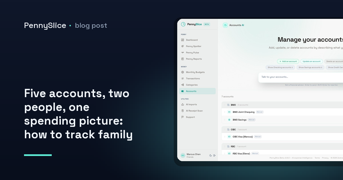
  • Five accounts, two people, one spending picture: how to track family spending across multiple accounts

    Five accounts, two people, one spending picture: how to track family spending across multiple accounts

    Two people, a joint chequing account, two personal chequing accounts, a shared credit card and one card that only one of you uses for work reimbursements. Five accounts. Every one of them, looked at alone, looks fine. Nothing is overdrawn. Nothing is obviously wasteful. And yet the month ended tighter than it should have, and neither of you can say where it went.

    That is not a discipline problem. It is a shape problem. The household spends as one unit and the data arrives in five pieces, and the pieces are each small enough to look reasonable.

    Why per-account views hide the household pattern

    Say groceries land in three places. The big weekly shop goes on the joint card. Top-up trips go on whichever personal card is in whichever pocket. Occasionally one of you grabs something on the way home and it lands on the work card and gets reimbursed later, or doesn’t.

    Open the joint card statement and groceries look like a controlled, predictable line. Open either personal account and the grocery spend there is a rounding error next to rent or a car payment — not worth a second look. The total is only visible if something adds the three together, and nothing in a per-account view does.

    The same fragmentation hits every shared category. Restaurants split across two people. Kids’ clothing bought by whoever is at the shop. Subscriptions where one is billed to a personal card because that’s whose email set it up, and the other three are on the joint one. Each fragment is defensible. The sum is the thing you actually wanted to see, and it is the one number no single statement contains.

    Per-person views have the same flaw pointed the other way. Splitting by human tells you who spent, which is a fine answer to a question most households are not asking. “Did we overspend on groceries” is a household question. “Which of us overspent on groceries” is a different conversation, and usually a worse one.

    The merge is where categories break

    Most attempts at household expense tracking with multiple people fail at the join, not at the collection. Getting five accounts into one place is the easy half. Keeping the categories coherent once they are there is the half that quietly falls apart.

    Three things go wrong.

    The same merchant is categorized differently in each source. One account has the supermarket as Groceries, another has it under a generic Shopping bucket the bank assigned, a third has the merchant name mangled into an unrecognisable string with a store number attached. Merged, that is three categories where there should be one.

    Transfers between your own accounts count as spending. Move money from joint to personal to cover something and a naive merge records an expense on one side and income on the other. Do that four times a month across five accounts and the household totals are fiction.

    Mixed-basket purchases get filed as one thing. The single largest distortion in household data is the big-box trip. A £140 shop that is groceries, a jacket, cleaning supplies and a bag of soil gets categorized as whatever the merchant is most associated with, and the grocery line absorbs the lot. Do that twice a month and your grocery budget looks broken while your clothing budget looks untouched.

    That third one is why sub-transaction categorization matters more in a household than anywhere else. PennySlice splits a single purchase across several categories at the line-item level — one trip becomes groceries plus clothing plus household, automatically. If you want the mechanics, splitting a Costco receipt at the line level walks through a single basket end to end.

    How to track family spending across multiple accounts in one view

    The practical setup has three parts.

    Get all five accounts in, by whichever route suits each one. You can link accounts through Plaid, where the login is entered at your own bank and what comes back is a revocable read-only token — available on paid tiers, US and Canada at launch, with a cap of 3 linked accounts on Insight and 10 on Predict. Or you can import: CSV, Excel, OFX, PDF, forwarded email, or a photo of a receipt. There is no template to choose and no column-mapping step; the structure gets detected from the file. Most households end up mixing both — link the two accounts you check constantly, import the card that only sees occasional use. If you’re on the import path and unsure where the export button lives, the Canadian bank export guides cover the major institutions step by step, and guides exist for 104 banks across 14 countries.

    Turn on household sharing. Multiple people, shared accounts, shared budgets, one view. This is the part that makes a shared budget for a household mean something: the budget is set against the merged total, not against one person’s slice of it. Both of you see the same numbers, which removes the recurring task of one person exporting a spreadsheet for the other.

    Fix categories once, at the line level. When a merchant is misfiled, correct it. Corrections improve categorization for everyone using the platform, so accuracy compounds as it gets used. The related mechanic — categorizing a receipt line by line — is what keeps a mixed basket from collapsing into a single misleading category.

    Asking the household question directly

    Once the data is merged, the useful interface is not a dashboard you have to interpret. It is a question.

    “What did we spend on groceries last month across all accounts?” gets a figure. “Which merchant took the biggest share of our spending in Q3?” gets a name and a number. “Are the kids’ activities costing more than they did in spring?” gets a comparison. The conversational AI covers eight areas — transactions, accounts, categories, budgets, imports, receipts, predictions and what-if scenarios — and answers are grounded in your own data rather than general guidance. There’s a fuller breakdown of what you can actually ask if you want the scope.

    Running behind that, seven Penny Spotter detectors work without being asked. Budget pace flags a category on track to exceed its budget before the month closes. Recurring cost creep catches the subscription that went up quietly — the exact thing that hides in a household, because the person who set it up isn’t the person watching the joint account. Merchant concentration surfaces where a single merchant is taking an outsized share. Predicted expenses name bills before they land.

    For a household, the timing matters more than the accuracy. Learning in the second week that a category is pacing over is a decision you can still act on. Learning it on the 31st is a post-mortem.

    Where to start

    Pick the two accounts that carry the most shared spending — usually the joint chequing and the card you both use — and get those in first. Link them or import a few months of history, whichever is faster for your bank. One view of both partners’ spending on the two accounts that matter most will tell you more in an afternoon than five separate statements have all year. Add the other three once you can see the shape.

    Track is free forever, and paid plans come with a 30-day trial that does not ask for a card.

    PennySlice provides spending information, not financial advice.

  • Why Did My Spending Go Up This Month? Finding the Category That Actually Moved

    Why Did My Spending Go Up This Month? Finding the Category That Actually Moved

    You look at the total and it’s $4,380. Last month it was $3,720. Nothing obvious happened — no vacation, no new car, no medical bill. You didn’t feel like you spent $660 more. And now you’re scrolling a transaction list looking for a purchase big enough to explain it, and there isn’t one.

    There usually isn’t. A $660 swing is rarely a $660 purchase. It’s more often three categories moving $150 to $250 each in the same direction, plus a couple that quietly went the other way and hid part of the difference from you.

    The total is the wrong number to stare at

    A month-over-month total is an aggregate of dozens of independent behaviours. Groceries, fuel, subscriptions, one annual insurance renewal, a birthday, a dentist. Each moves for its own reason. Summing them produces a figure that is real but has no cause attached to it, which is why staring at it doesn’t resolve anything.

    The pie chart has the same problem in a prettier format. A pie chart shows composition for one month. Groceries at 22% tells you groceries are a big slice — it does not tell you whether 22% is normal for you, because you have no baseline in the frame. Two pie charts side by side are marginally better and still hard to read, because the slices resize relative to a total that itself changed. A category can grow in dollars and shrink as a percentage in the same month.

    What you actually need is a per-category delta in dollars, ranked, with the negatives included.

    Build the comparison from an export

    If you’re doing this by hand, the shape of the work is the same regardless of tool.

    Pull both months as a single file. Export a date range that covers this month and the previous one from each account you use. Most banks let you set a custom range and download CSV; the mechanics differ per institution, and if you’re in Canada the export steps for RBC, TD, Scotiabank, BMO, CIBC and National Bank are documented step by step.

    Get every account in, not just the busy one. A comparison built on your checking account alone will miss the credit card where the change actually happened. Partial data produces a confident wrong answer, which is worse than no answer.

    Sum by category and month, then subtract. Pivot table, one row per category, one column per month, a third column for the difference. Sort that difference column descending.

    Read the bottom of the list too. The categories that went down are doing real work. If dining rose $310 and travel fell $180, your total only moved $130 and the dining change is invisible in the headline figure. This is the single most common reason people conclude “nothing changed” when something did.

    What you get is a short list — usually two to four categories carrying nearly all of the movement, and a long tail of ±$20 noise you can ignore.

    One month over one month is a weak baseline

    Having found your movers, resist treating last month as truth. Last month is one sample. If your groceries run $520, $610, $480, $590 across four months, then a $610 month isn’t an anomaly — it’s the top of your normal range. Compared against a $480 month it looks like a 27% spike.

    A better test: does this month fall outside the range the same category has occupied over the last several months? That’s what spending anomaly detection means in practice — not “bigger than last time” but “outside this category’s own established pattern.” A category with a stable history flags on a small deviation. A category that’s always volatile needs a much bigger move before it means anything.

    Three things separate a real change from noise:

    • Frequency versus size. Twelve dining transactions instead of seven is a habit change. Seven transactions where one was $240 is an event. These need different responses and look identical in a category total.
    • Timing artefacts. A bill that landed on the 1st last month and the 31st this month puts two of them in one calendar month. Nothing changed except the calendar.
    • Creep. A subscription that went from $12 to $17, three of them, is $15 a month you never decided to spend. It won’t stand out in any single month’s list, and it never reverses on its own.

    Where the categories themselves lie to you

    One structural problem breaks all of the above: a lot of transactions aren’t one category. A $214 Costco charge lands as “groceries,” and inside it are $130 of food, $50 of clothing and $34 of household supplies. When that charge is $290 the following month, your groceries line moves $76 and you have no idea whether you bought more food or more sheets.

    Merchant-level categorization makes big-box and warehouse spending structurally unreadable — which matters because that’s often exactly where household spending concentrates. The fix is splitting at the line level rather than the transaction level, so a single trip resolves into the three or four categories it actually was. PennySlice does this automatically, and it also runs on photographed receipts, so a paper receipt becomes itemized lines categorized individually.

    Asking instead of building the pivot table

    The manual version works. It also takes an hour, and you have to remember to do it, which means you’ll do it once.

    PennySlice runs the comparison as a conversation. Drop in a CSV, Excel, OFX or PDF export — the AI reads the structure, so there’s no template to choose and no columns to map — or link a bank through Plaid on a paid tier, where your login is entered at your own bank and comes back as a revocable read-only token. Then ask what changed in your spending compared to last month, and get the ranked per-category delta with real figures from your own data. Comparing months is one of the eight areas the chat covers.

    You also don’t have to remember to ask. Penny Spotter runs seven detectors in the background, three of which target exactly this question: category anomalies, where spending breaks your own established pattern; recurring cost creep, where subscriptions and bills quietly rose; and budget pace, which flags a category on track to exceed its budget before the month closes rather than after.

    That last distinction is the point of doing any of this. Finding the category that moved on the 3rd of the following month is a post-mortem. Finding it on the 12th, while the month is still running, is information you can still use.

    Start with two months and one file

    Export this month and last month from every account you use, load them in one file, and ask what moved. The list will be shorter than you expect — and one of the names on it will be a category you’d have sworn was flat.

    PennySlice provides spending information, not financial advice.
  • Going Over in the Same Category Every Month: Catching It on Day 12 Instead of Day 30

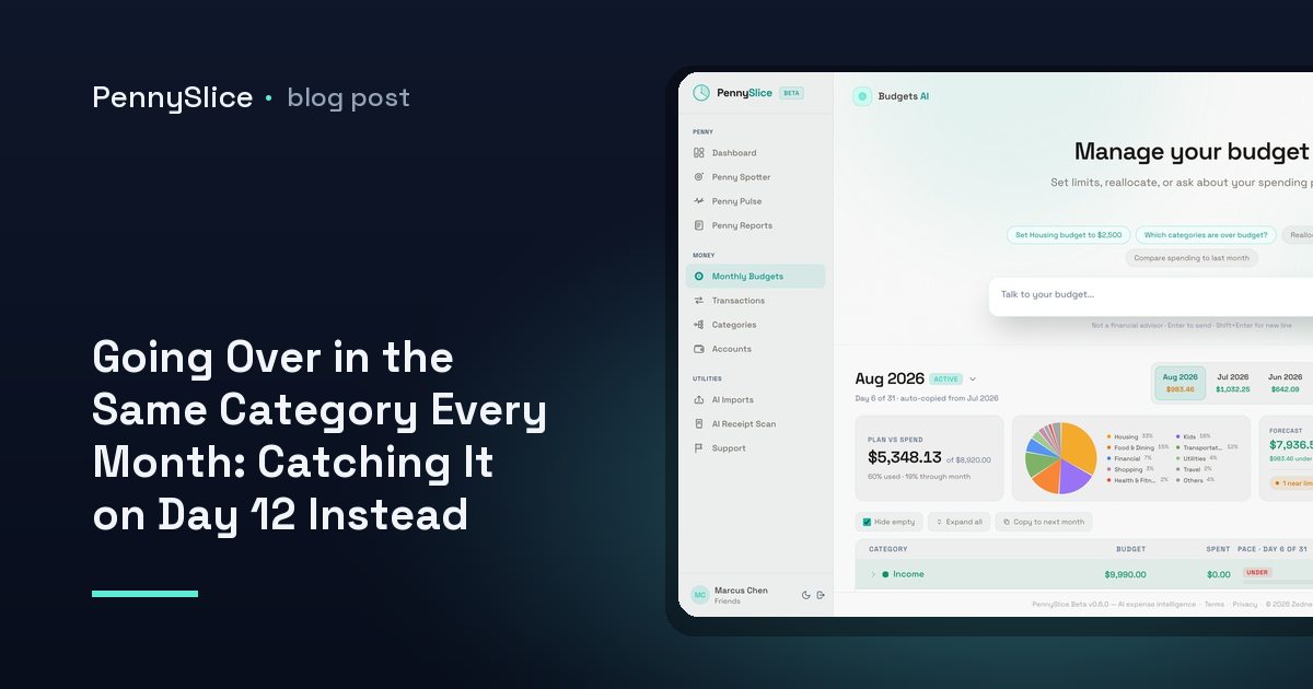
    Going Over in the Same Category Every Month: Catching It on Day 12 Instead of Day 30

    It is the same category every month. Dining, or groceries, or the one that quietly absorbs everything that does not fit anywhere else. You set $600. You end at $780. You look at the number on the first of the next month, note it, resolve to do better, and then land at $760 four weeks later.

    The resolution is not the problem. The timing is. A monthly budget is a scoreboard that only updates once, at the end, when every transaction that made up the overage has already cleared. Nothing about a $780 total tells you anything you could have acted on, because by the time it exists there is no month left to act in.

    Why do I keep going over budget in the same category?

    Because the category is the one where your spending is made of many small decisions rather than a few large ones.

    Rent does not surprise anyone. It is one transaction, a known amount, on a known day. Dining is thirty or forty transactions between $9 and $70, spread across four weeks, each one individually reasonable. There is no single moment where you decide to overspend by $180. There are eleven Thursdays and a weekend where a friend was in town.

    That structure means the overage is invisible from inside the month. You know you had lunch out. You do not know whether that lunch was the one that put the category on a path to $780, because you do not carry a running total in your head and the ones the bank shows you are not organised by category anyway.

    And there is a second reason, which is that some of the spend is not filed where you would look for it. A single big-box trip that shows up as one $240 line under groceries usually is not one category — part of it is household supplies, part of it might be clothing. If that whole line lands in groceries, groceries looks like the problem category when it is not. Splitting a receipt at the line level changes which category the month is actually running hot in.

    The mid-month total on its own means nothing

    The obvious fix is to check in halfway through. On day 15 of a $600 dining budget you have spent $310, which is just over half, so you are fine. Except you are probably not, because months are not flat.

    Your own spending has a shape. For most people, dining is heavier at the end of the month than the start, or heavier on the weekends closest to payday, or front-loaded because a standing Friday habit clusters early. A calendar-proportional check — 50% of the month gone, 50% of the budget gone, all clear — assumes an even distribution that almost nobody actually has.

    So the useful comparison is not spend-so-far against the calendar. It is spend-so-far against your spend-so-far in previous months at the same point.

    Category budget pace, with real numbers

    Here is what that looks like on a dining budget of $600.

    Across your last several months, your dining spend by day 12 averaged $210 — about 35% of the month’s total, because your dining is back-weighted. That 35% is the pace baseline. It is derived from your history, not from a rule of thumb.

    This month, on day 12, you are at $294.

    Against the calendar you look fine: day 12 of 30 is 40% of the month, and $294 is 49% of $600. Slightly ahead, nothing alarming. Against your own pace you are 40% over where you normally are, and projecting the rest of the month on your normal shape puts the category at roughly $840.

    That is a $240 overage, identified on day 12, with 18 days of dining decisions still ahead of you. The same fact arriving on day 30 is a receipt. Arriving on day 12 it is a number you can still do something about — and what you do about it is yours to decide, which is the point.

    Budget alerts before overspending, not after

    This is one of seven background detectors in Penny Spotter. They run without being asked, on whatever data you have put in — a linked account, an imported CSV, or both.

    • Budget pace flags a category on track to exceed its budget before it does, using the comparison above.
    • Category anomalies flag spending that breaks your own established pattern, which is a different signal — a $340 vet bill is not a pace problem, it is a one-off, and treating the two the same produces a month of noise.
    • Recurring cost creep catches subscriptions and bills that rose quietly, which is a common reason a category drifts over without any change in behaviour.
    • Predicted expenses surface bills that are still coming, so a category that looks under budget on day 20 does not look under budget because the annual renewal has not landed yet.

    That last one matters more than it sounds. Half of what feels like an unexplained overage is a known bill you had stopped thinking about.

    What to ask when the flag arrives

    A flag tells you a category is running ahead. It does not tell you which part of the category, and that is usually the question you actually have. So ask it in plain English:

    • “What’s driving dining this month compared to last month?”
    • “Which merchants are new in this category?”
    • “How much of my dining is weekday lunch?”
    • “If I keep going at this rate, where does dining land on the 30th?”

    Answers come back with figures from your own transactions rather than general guidance. What-if questions run against your real balances and history, so “can I absorb a $400 flight next month” gets a number. Spending, categories, budgets and predictions are four of the eight areas the chat can answer across.

    The categorization side is what makes the pace figure trustworthy in the first place. One purchase can be split across several categories at the line level, so the dining number is dining and the grocery number is groceries. A pace alert built on a category that is quietly absorbing three kinds of spending will fire at the wrong time, or not at all.

    How to tell if you’re going to overspend this month

    You need three things, and only three: a budget on the category, enough transaction history for the system to know your normal shape of the month, and a check that happens without you initiating it.

    The third is the one people skip. Manual mid-month reviews work exactly as long as you keep doing them, which for most people is about six weeks. A background detector does not need to be remembered.

    Set a budget on the one category you already know is the problem — the one you could have named before you started reading. Import a few months of history, or link the account, and let pace tracking establish what your normal day-12 number looks like. Then wait for the flag instead of the total.

    PennySlice provides spending information, not financial advice.
  • Two People, Eight Accounts, One View — How to Share a Budget With Your Partner Without Sharing Passwords

    Two People, Eight Accounts, One View — How to Share a Budget With Your Partner Without Sharing Passwords

    There is usually one person in a household who does the money. They have a spreadsheet, a rough sense of what groceries cost, and — somewhere in a notes app or the back of their head — their partner’s banking password.

    Nobody planned it that way. It happened because the tool needed one login and one set of accounts, so one person did the setup and the other person handed over credentials to be included. Now the admin is a single point of failure for two people’s finances, and the other person has no visibility at all unless they ask.

    That trade — visibility in exchange for passwords — is not actually necessary. A shared view can be assembled from two separate data paths that each person controls independently.

    Why the password handoff happens

    Most expense tools are built around one account holder. The data model assumes one person, one email, one pile of transactions. If a second person’s spending needs to appear in the same picture, the only route in is through the first person’s setup.

    So the second person gives up their login, or their spending simply is not in the picture. Both outcomes are bad. In the first, one person now holds credentials they should not hold. In the second, the household budget is missing whichever chunk of the month happened on the other card — which, in a household with five to eight accounts between two people, is most of it.

    The fix is not a better spreadsheet. It is a structure where each person’s data enters on their own terms and lands in a shared view.

    How to share a budget with your partner without sharing passwords

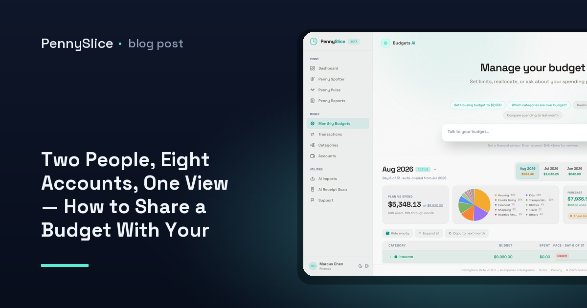
    PennySlice household sharing puts multiple people, shared accounts and shared budgets into one view. What matters here is how the data gets into that view: each person chooses their own path, separately.

    There are two paths, and they carry equal weight.

    Link a bank. Linking runs on OAuth through Plaid. The login is entered at the bank’s own site, not at PennySlice. What comes back is a read-only token for transactions and balances — no credential ever reaches us, and nothing about the process requires your partner to tell you anything. They do their own link. You do yours. Bank linking is available on paid tiers, in the US and Canada.

    Import your own exports. CSV, Excel, OFX, PDF, a forwarded email, or a photo of a receipt. No standing connection to any account. The AI reads the file and works out its structure, so there is no template to pick and no columns to map. If your partner would rather not link anything at all — or banks somewhere linking does not reach — this is a complete path, not a fallback. Our guides for exporting from Canadian banks show what that file actually looks like coming out of RBC, TD, Scotiabank, BMO, CIBC or National Bank.

    You can mix the two freely. One partner links, the other imports. Both link. Both import. The household view does not care which route each account arrived by.

    A household budget with separate accounts, still counted once

    Separate accounts are the normal case, not the awkward exception. Two salaries, two current accounts, one or two joint accounts, a couple of credit cards, maybe some freelance income on one side.

    A shared household setup treats those as one financial picture with shared budgets across all of them. The grocery budget is the grocery budget, whether the shop happened on your card or theirs. Penny Spotter’s budget pace detector runs against the household total, so a category tracking toward overspend gets flagged once, for both of you, rather than each person separately discovering it late.

    The same applies to the other detectors running in the background: recurring cost creep, category anomalies, predicted expenses, merchant concentration. A subscription that quietly rose is a household cost even if it sits on one person’s card. Splitting the accounts across two apps hides exactly the patterns that are worth seeing.

    The Costco problem, which households have worse than anyone

    Households generate a specific kind of mess: one transaction that is genuinely several categories. A single big-box run is groceries, clothing and household supplies in one line on the statement. Assigning it to “groceries” makes the grocery budget look absurd and the clothing budget look untouched.

    Sub-transaction categorization splits one purchase across several categories at the line-item level, automatically. Photograph the receipt and the OCR itemizes it, with each line categorized on its own. We wrote about how a single Costco trip gets split at the line level if you want the mechanics.

    For a two-person household this matters more than it does for one person, because the receipts are bigger and there are more of them.

    Give your partner access to spending data without giving up control

    The part that makes the password handoff genuinely uncomfortable is that it is hard to undo. Changing a password to revoke someone’s access is a blunt instrument, and it usually breaks something else.

    A linked account works differently. The token is revocable at any time, from either side — from PennySlice, or from the bank. If someone wants their account out of the shared view, they remove it themselves. They do not need to ask the household admin, and the admin does not need to do anything on their behalf.

    Imported data has an even smaller footprint: there is no standing access to revoke, because there was never a connection. A file was read, and that is the whole relationship with the account.

    A few facts worth stating plainly, because privacy claims in this category are usually vaguer than they should be. Bank passwords are never stored — the login is entered at the bank. We never sell your data, to advertisers or anyone else. There are no ads. Personal identifiers like names, emails and account numbers are not sent to the AI provider. Financial data itself — merchant names, amounts, categories — is processed by a third-party LLM provider and discarded, not retained for training. Plaid is a disclosed processor for linked accounts.

    One view means you can both ask it things

    The point of pulling two people’s spending into one place is not the dashboard. It is that either of you can ask a question in plain English and get a real figure back, across transactions, accounts, categories, budgets, imports, receipts, predictions and what-if scenarios — the eight areas the chat actually covers.

    “What did we spend on eating out last month?” is a number, not a negotiation. “Can we afford the flights in March?” gets answered against real balances and history through Pulse Check. And once a month, Penny Reports writes up what happened and what to watch — which is the conversation the household admin was previously having alone, in a spreadsheet, on a Sunday.

    Corrections compound, too. When either of you fixes a miscategorized transaction, categorization improves for everyone using the product.

    Start with whichever account is easiest

    Pick one account — yours or a joint one — and get it in, by whichever path is less friction today. Export a CSV and drop it in, or link it through your bank. Then add the second person’s, their way. The shared view builds from there, and nobody has to type a password into anything but their own bank.

    Track is free forever. Paid plans, which include bank linking, come with a 30-day trial and no card required.

    PennySlice provides spending information, not financial advice.
  • How to Track Spending Without Giving an App Your Bank Login — and When Linking Is Worth It

    How to Track Spending Without Giving an App Your Bank Login — and When Linking Is Worth It

    You get to the third screen of a new expense app and it asks for your online banking username and password. Not a redirect to your bank — a form, on their domain, with their logo on it. That is the moment most people close the tab, and it is a reasonable instinct.

    There are two ways to get transaction data into PennySlice, and neither one involves typing your banking password into PennySlice. One requires no standing access to any account at all. The other uses a revocable, read-only token issued by your bank. They cost you different things and they are available in different places.

    How to track spending without giving an app your bank login

    Import your own exports. Every bank has an export button somewhere — usually on the transaction list, sometimes buried under “statements” or “download”. You pull a file, you drop it into PennySlice, and that is the whole handshake. No credentials change hands, no token is issued, nothing is left connected when you close the tab.

    PennySlice accepts CSV, Excel, OFX and PDF, plus forwarded email receipts and photos of paper receipts. There is no template to choose and no column-mapping step. The AI reads the file, works out which column is the date and which is the amount, and handles the fact that your bank writes debits as negative numbers and your credit card writes them as positive ones.

    That matters more than it sounds. Column mapping is where most people abandon an import — six dropdowns, unclear labels, and a preview table that looks wrong. If you have tried an expense tracker that accepts CSV upload before and given up at that screen, the difference here is that there is no screen.

    What import costs you is a recurring action. Nothing arrives on its own. You do it monthly, or weekly if you like tighter numbers, and if you skip a month the data has a hole in it. For some people that is a fair trade and for others it is the reason they stopped using spreadsheets.

    What it buys you, beyond the credential question: it works with any bank in any country. If your bank can produce a file, PennySlice can read it. There are 104 bank export guides in the product covering 14 countries, with the heaviest coverage in the US and Canada, then the UK, then eleven more European markets. If you bank in Canada, the export steps for RBC, TD, Scotiabank, BMO, CIBC and National Bank are already written down.

    What read-only bank access actually means

    The other path is linking a bank, and it is worth being precise about the mechanism, because “connecting your bank” gets used to describe two very different things.

    PennySlice links through Plaid using OAuth. You pick your bank, your bank’s own login page opens, and you authenticate there. The credentials go to the bank, not to PennySlice, and PennySlice never stores your banking password because it never receives it.

    What comes back is a read-only bank access token scoped to transactions and balances. Read-only means it cannot move money, initiate a payment or change anything in your account. It can look. And it stays valid only as long as you want it to — you can revoke it from inside PennySlice, and you can also revoke it from your bank’s own connected-apps settings, which is the more reassuring of the two because it does not depend on us cooperating.

    The cost of linking is that it is narrower. Bank linking is available in the US and Canada only. Not the UK, not the EU, regardless of how many export guides exist for those markets. If you bank in Amsterdam or Manchester, import is your path, and it is a complete path — the whole product runs on imported data.

    Linking also sits on the paid tiers. Insight supports up to 3 linked accounts, Predict supports up to 10. Track is free forever and works on imports.

    What linking buys you is that transactions show up without you doing anything. That is not just convenience — it is what makes the background detection useful. Penny Spotter runs seven detectors continuously: budget pace, category anomalies, recurring cost creep, predicted expenses, savings opportunities, income changes and merchant concentration. A subscription that quietly rose gets flagged when it rises, not when you next remember to export a file.

    The honest comparison

    Import your own Link a bank
    Credentials Never entered anywhere but your bank Entered at your bank, via OAuth
    Standing access None Read-only token, revocable
    Freshness As of your last import Continuous
    Effort Recurring, manual One-time setup
    Where it works Anywhere your bank exports a file US and Canada
    Tier Track and up Insight (3 accounts), Predict (10)

    Neither column is the correct answer. They are answers to different questions — how much access am I comfortable granting, and how much manual work am I willing to do.

    Most people should mix both

    These are not exclusive. You can link the two accounts where daily accuracy matters and import everything else on your own schedule.

    A common shape: link the main checking account and the card you use most, so balances and predicted bills stay current. Import the business card quarterly, because you only look at it at tax time anyway. Photograph the receipts that matter and let the OCR itemize them.

    That last piece is where import earns its place even for people who have linked everything. A bank feed tells you one line: Costco, $214.86. It cannot tell you that the trip was groceries, a jacket and a case of printer paper, because the bank does not know either. A photographed receipt can, because PennySlice splits at the line-item level and categorizes each line separately — which is the difference between one Costco charge being one category and being three.

    Household accounts make the mixing more obvious. Two people, five to eight accounts, one of them at a credit union Plaid does not cover — that account gets imported, the rest get linked, and the household view treats them identically once the data is in.

    What is the same either way

    Once the data has landed, the path it took stops mattering. You ask questions in plain English and get answers with your own figures in them, across eight areas: transactions, accounts, categories, budgets, imports, receipts, predictions and what-if scenarios. Pulse Check answers “can I afford a laptop next month” against real balances rather than a rule of thumb. Penny Reports summarize the month.

    Sub-transaction categorization works on imported lines and linked ones. Spotter runs on both, though it has fresher material to work with when data arrives continuously.

    Two things are worth stating plainly rather than implied. Financial data — merchant names, amounts, categories — is sent to a third-party AI provider for processing, where it is processed and discarded rather than retained for training. Personal identifiers like your name, email and account numbers are not sent. And we do not sell your data, to advertisers or anyone else, and there are no ads.

    Start with a file

    Whichever path you end up on, start by exporting one month from one account and dropping it in. You will know inside a few minutes whether the answers are worth having, and you will not have granted anything to find out. Paid plans have a 30-day trial with no card required if you decide linking is the better fit after that.

    PennySlice provides spending information, not financial advice.
  • How to Track Spending Without Linking Your Bank Account — and When Linking Is Worth It

    How to Track Spending Without Linking Your Bank Account — and When Linking Is Worth It

    You got to the second screen of an expense app, it asked for your online banking login, and you closed the tab. That reaction is reasonable. It is also, in most apps, the end of the road — no login, no product.

    PennySlice has two doors, and they both lead to the same place. You can hand it files you exported yourself, or you can authorise a read-only connection through your bank. Neither one is the “real” way. They differ in effort, in coverage, and in how much standing access you hand over.

    Track spending without linking your bank account: the import path

    Every bank with an online portal lets you download your own transactions. Usually as CSV, sometimes Excel, often OFX, and almost always PDF statements. That file is the entire input PennySlice needs.

    Drop it in and the AI reads the structure itself. There is no template to choose and no column-mapping screen where you tell it which field is the date and which is the amount. Banks format exports inconsistently — different column orders, debits as negatives or in a separate column, dates in three regional formats — and the detection step is there so you never have to think about any of that.

    The accepted formats:

    • CSV — the most common bank export, and the cleanest input
    • Excel — .xls and .xlsx, straight from the download
    • OFX — the format built for financial data interchange, common in desktop banking exports
    • PDF — a monthly statement, when your bank offers nothing better
    • Email forwarding — forward a receipt or a statement notification
    • Photo — snap a paper receipt and get itemised lines back

    PDF deserves a note. If your bank only offers statements as PDF, that works: PennySlice reads the transaction table out of it. But a CSV or OFX from the same bank will parse more cleanly, so if the export menu offers both, take the structured one.

    What import costs you is a recurring errand. Once a month you log into your bank, download a file, and drop it in. Two minutes, but two minutes you have to remember. What it gives you is that PennySlice holds no standing access to anything. There is no token, no connection, nothing to revoke — just a file you chose to hand over.

    It also works everywhere. A bank in Berlin, Dublin, Madrid or Melbourne exports CSV the same way a bank in Ohio does. There are 104 export guides in the product covering banks across 14 countries — heaviest in the US and Canada, then the UK, then eleven more European markets — because “where is the export button on my bank’s site” is the only genuinely hard part of this path. The Canadian bank export guide is a good example of what those look like: click paths for RBC, TD, Scotiabank, BMO, CIBC and National Bank, no interpretation required.

    What a linked bank actually gives you

    Linking runs through Plaid. The part that matters: you enter your banking login at your bank’s own site, not at PennySlice. What comes back to us is a read-only token for transactions and balances. We never see or store your bank password, and you can revoke the token at any time — from inside PennySlice, or from your bank’s own connected-apps settings.

    Read-only is literal. The token permits reading transactions and balances. It cannot move money.

    What you get in exchange for that access is the disappearance of the monthly errand. Transactions arrive on their own, which means the background detectors have something current to work with. Penny Spotter runs seven of them without being asked — budget pace, category anomalies, recurring cost creep, predicted expenses, savings opportunities, income changes and merchant concentration. A subscription that quietly went up in March is more useful to know about in March than in a batch import in June.

    The constraint is geographic. Bank linking is available in the US and Canada only at launch. This is worth separating from the export guides above: guides exist for 14 countries, but linking does not. If you bank in the UK or the EU, import is the path — and it is the whole product for you, not a lesser version of it.

    Linking is also on paid tiers only, with a cap on connected accounts: three on Insight, ten on Predict. Paid plans come with a 30-day trial and no card required, so you can see whether an automatic feed changes how much you actually use the thing before you decide.

    Mixing both

    Most people with messy finances end up here. Link the two accounts that generate the most volume — the daily-spend checking account, the main credit card — and import the rest when you need them. A once-a-year business account, a joint account at a bank Plaid does not reach, a foreign card from a trip.

    The distinction stops mattering after ingestion. Both paths land in the same data, and the conversational interface does not care where a transaction came from. You ask in plain English across transactions, accounts, categories, budgets, imports, receipts, predictions and what-if scenarios, and you get figures out of your own history rather than general guidance.

    Categorisation works the same way on both, too, including at the line-item level. One supermarket run is rarely one category, and PennySlice splits a single purchase across several — groceries, clothing and household out of one Costco trip rather than one lump filed under whichever category won.

    Which door to walk through

    The honest version: pick based on the errand, not the ideology.

    If handing an app any standing access to your bank is a hard no, import is not a compromise. It is a complete path with no connection to revoke, and the free Track tier is where you start.

    If you bank outside the US or Canada, import is your path today regardless of preference.

    If your problem is that you have abandoned three trackers because you stopped feeding them, the monthly download is the thing that will kill the fourth. Link the accounts, let the feed run, and spend your attention on the alerts instead of the data entry.

    Either way, start with one month of one account. Export it, drop it in, and ask where the money went. If the answer is not more specific than what you already knew, nothing else about the product will matter.

    PennySlice provides spending information, not financial advice.
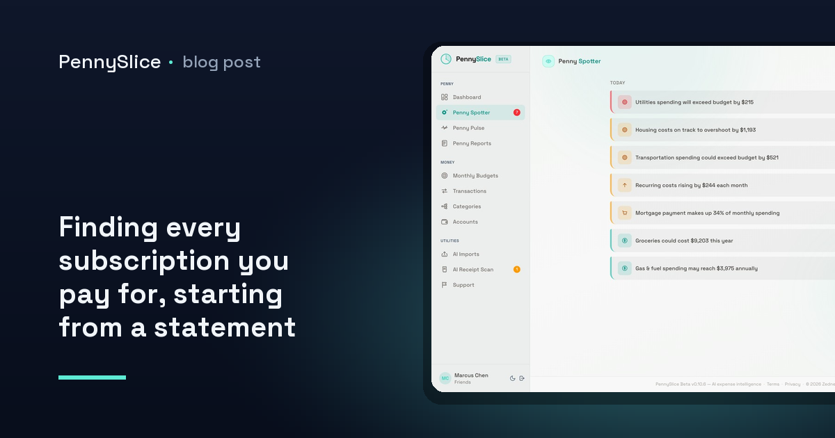
  • Finding every subscription you pay for, starting from a statement file

    Finding every subscription you pay for, starting from a statement file

    You know about the big ones. The streaming service, the phone plan, the gym. What you do not know about is the $6.99 that has been leaving your checking account every month since a trial you started in a hotel room two years ago, or the cloud storage plan that was $2.99 when you signed up and is $4.99 now, or the software seat you kept paying for after you stopped using the software.

    The money is not the interesting part. The interesting part is that this is all written down. Every one of those charges appears on a statement you already have access to, in order, with dates and amounts. The information is sitting in a file. It just is not arranged in a way that makes a pattern visible to a human scrolling a PDF.

    Why subscriptions are hard to see on a statement

    A monthly statement is organized by date, which is exactly the wrong axis for finding recurring charges. A subscription is a vertical fact — the same merchant, roughly the same amount, once every billing cycle — and a statement presents everything horizontally, one month at a time, mixed in with groceries and gas.

    So to spot a subscription by eye you have to hold twelve documents in your head at once and notice which merchant names appear in all of them. People are bad at this, and they are worst at it precisely where it matters: small amounts. A $79 charge gets noticed. A $4.49 charge does not, and $4.49 a month is $53.88 a year.

    Merchant naming makes it harder. The same subscription can post as three different descriptor strings depending on the processor, the currency, and whether the charge went through an app store. Two lines that look unrelated on the page are the same product.

    How to track subscriptions without connecting my bank

    You do not need a standing connection to an account to do this analysis. You need history, and history is what an export gives you.

    Most banks let you download transactions as CSV, Excel or OFX, and nearly all of them will hand you a statement PDF. PennySlice reads all of those, plus email forwarding and a photo of a receipt. There is no template to choose and no column-mapping step — the AI reads the file and works out its structure, whether the date column is called Date, Posted, or Transaction Date, and whether debits are negative numbers or a separate column.

    That matters more than it sounds. The setup screen is where most people quit an expense tool. Dragging in a file you already downloaded is a shorter path than deciding which of your accounts to authorize.

    If you are not sure where the export button lives at your bank, that is a solved problem too — there are 104 bank export guides in PennySlice covering 14 countries, and if you are in Canada the walkthrough for RBC, TD, Scotiabank, BMO, CIBC and National Bank will get you a file in a few minutes.

    Linking a bank is also on the table if you would rather not repeat the export each month. That path runs through Plaid — the login is entered at your own bank, not at PennySlice, and what comes back is a revocable read-only token. It is available on paid tiers, in the US and Canada. Import works everywhere, on every tier. Both paths land in the same place, so this is genuinely a preference and not a compromise.

    Find subscriptions from a bank statement PDF, in one question

    Once a file is in, you do not go hunting through a table. You ask.

    What charges repeat every month? Which merchants did I pay in every one of the last six months? What am I paying for that I only used once? The conversational interface covers transactions, accounts, categories, budgets, imports, receipts, predictions and what-if scenarios — eight areas, all grounded in the data you imported, answered with your actual figures rather than a general principle about subscriptions.

    The useful version of this question is the twelve-month one. Import a year of history and the vertical pattern becomes trivially visible: same merchant, same day-of-month, similar amount. That is a subscription whether or not you remember signing up for it.

    A year of history also makes the second, harder question answerable — not what am I paying for but what am I paying more for than I used to.

    Subscription price increase tracking is the part people skip

    Cancelling three dead subscriptions is satisfying and finite. You do it once, you feel good, and then you stop looking. Meanwhile the subscriptions you actually want keep drifting upward, a dollar at a time, in increments too small to trigger a reaction.

    This is recurring cost creep, and it is one of the seven things Penny Spotter watches for in the background without being asked. The detector compares what a recurring charge costs now against what the same charge cost across your own history, and flags the ones that rose. Not “subscriptions often increase” — the specific merchant, the old amount, the new amount.

    The other six detectors run on the same data at the same time: budget pace, category anomalies, predicted expenses, savings opportunities, income changes, and merchant concentration. The predicted-expenses detector is the natural companion to subscription tracking, because a recurring charge is the most predictable transaction you have. Once the pattern is established, the bill that is about to land can be surfaced before it lands.

    And if you want to test a decision rather than just observe one, Pulse Check answers what-if questions against your real balances and history — a number, not a maxim.

    What this looks like after the first import

    Drop in one year of transactions. Ask what repeats. You get a list of recurring merchants with amounts and cadence, built from your own history rather than from a directory of known subscription companies — which means it catches the local ones, the annual ones, and the ones billed through an app store under a name you would not have recognized.

    Annual subscriptions are the quiet win here. They are the easiest to forget and the most expensive to forget, because you only see them once and by the time you see them they have already renewed. A twelve-month import surfaces them in the same pass as the monthly ones.

    From there, categorization keeps the picture honest. Charges get split at the line-item level where a single purchase genuinely belongs in more than one place — the same mechanism that turns one receipt into four categories applies to a mixed bill from a single provider. And corrections you make feed back into categorization for everyone, so accuracy compounds with use.

    One more thing worth knowing: your financial data — merchant names, amounts, categories — is sent to a third-party AI provider for processing and discarded afterward, not retained for training. Personal identifiers like your name, email and account numbers are not sent. We never store a bank password, and we never sell your data.

    Start with one file

    Download twelve months of transactions from your main account — CSV, OFX or the statement PDF, whichever is easier to get — drop it in, and ask what repeats every month. The Track tier is free forever, and paid plans come with a 30-day trial that does not ask for a card.

    PennySlice provides spending information, not financial advice.